Monday, December 31, 2007

TAST library of stitches

I have been busy collating my TAST samples and putting a spine edging on each so that I can make a library of stitches. I decided to use an old lever arch ring binder of my daughters, it is A4 size but can be cut down to the size I want. I have made holes in each spine piece and buttonholed around them for reinforcement. Using this method of book rather than signatures I can add to it a further date and it also allows for easy removal when one is needed for reference. Above are a collection of pages at various stages of completion. To view all my samples go to my Flickr pages

The examples above and below shows how I have decorated the spine with the page stitch.

My base fabric colour scheme is very festive, it wasn't intended they just happened to be the colours that I had to hand when I first started the challenge earlier this year. I have, however used a range of colour schemes on the pages. Some are harmonious, some monochromatic and some constrasting to show different effects. Finishing off these pages is for winter nights in front of the TV.

All I have to do now is make a cover for the folder, the fun bit. Embellished I think.


HAPPY NEW YEAR TO ALL.................

End of 2007!

As 2007 draws to an end it is only right to post a blog that sums up my past year. 2007 was my first year of blogging and communicating with a whole new community. It set me targets as I had deadlines to keep as part of the networks and groups I joined through contact via the blog, eg Tast, Unlimited Textiles and Sumptuous Surfaces. I enjoyed the many tutorials and spent hours absorbing the techniques displayed on numerous blogs and websites. Already signed up for the latest Sharon Boggin challenge "Take It Further". I have been busy putting al the TAST samplers into book format, will post a picture very soon.

It's official hyperlinks are additive! I developed certain skills that had only been seen in books and even invested in new equipment, my Janome Xpression being the most expensive. Other bloggers showed embellished examples and tips by the score and I have had so much fun. In the comfort of my own home I can experiment, create and explore the internet, I have discovered Picasa for photo manipulation and Flickr for uploading my photos for sharing. What a buzz I get from receiving an email from the other side of the world from someone who appreciates my work. Also being able to comment and encourage others on their work, being a retired teacher it never leaves you, the desire to encourage and praise.

I have been trying to clear the decks, finish work and generally get ready for 2008. I go into hospital on the 7th January to have my gall bladder removed and so I will be raring to go after that on all my new projetcs. As well as on line challenges I have 3 exhibitions coming up with my North West groups that I belong to. Silk-n-Threads have an exhibiton at Tatton Park in Cheshire from 15th March to 1st June. Society of Marple Artists celebrate their 40th annual exhibiton in April and Textile 21 are at Norton Priory from May to June, so lots of work to produce!!!!!!! I have some ideas already but there will have to be alot of juices flowing very soon!

A HAPPY NEW YEAR TO ALL.

Tuesday, November 27, 2007

Health Update

Latest in the saga of my health. Just been 'released' from hospital after a week of suffering the inconvenience of an acute inflammed gall bladder. Not nice. Lots of morphine, anti sickness tablets and liquid low fat food. Lost more weight, shouldn't complain! but now I have to now wait for the call for key hole surgery. Now that it has been diagnosed with hindsight I can see that I have been 'under the weather' for months now. Nagging back pain on the rightside especially at night, general uncomfortable torso pain, feeling seedy, and drinking lots of peppermint tea! So hopefully when the offending organ is removed I will feel like a new women, here's hoping!!! Hubby is expecting his wife back!

Must get back to my workroom soon as I can get rid of this fatique. I did manage to do some stitching whilst in Hospital, Silk-n-Threads are having a Christmas stocking competition this Friday, although I won't be able to attend I intend sending my entry, this is how it is looking at the mo. Embellished base fabric using silk velvet and silk which is them hand embellished, first side finished, may have to use a plain second side to save time.

embellished base

hand embellished first sidedetail of surface embellishment

Wednesday, November 14, 2007

Back Again!!

Been somewhat indisposed recently. Firstly I was very busy creating for two exhibitions that Silk-n-Threads were holding, both going very nicely up to date, see link on right. Then I managed to get a rather bad bladder infection due to some grit that scrapped the inside of my bladder. Both very painful and resulted in a trip in an ambulance to A&E and a visit from the emergency doctor. Two doses of strong antibiotics later I now feel better but if you have ever had to pass bladder or kidney stones you know what I went through.

However back to my workroom and finishing off all those pieces that have been sat around for far too long.

Firstly the finished book cover made from the fabric paper that I made back in early September. Pleased with the result as it is just the right size to fit in my larger handbags!


Back of the book cover.

I finally got around to having the Patchwork of Life embroidery mounted and framed ready for the exhibition at the Bollington Arts Centre.


Closeup of the stitching on Patchwork of life. I completed this as part of Sharon Boggon Sumptuous Surfaces course in the summer.

Sunday, September 30, 2007

Lutradur experiments

I've been experimenting with Lutradur recently using the details given in the new ezin Fibre & Stitch. Carol McFee takes you through the process and some stunning results have been created by subscribers to this months edition.

This was the first stage, above, when scrim and lace was painted on to Lutradur, left to dry and then played with!!!

Here I painted the surface with a selection of metallic paints, the purple (blue in photo) was added to bring life to the browns and metallics. I squeezed Luminere paint straight from the bottle.


Then I FME over the top with metallic threads to highlight the shapes in particular the areas of scrim. I then painted over some of these areas again to give more relief.


This is the final result, unfortunately the luminere lines reflect the light too much giving a false impression, in fact the lace relief areas are more pronounced than the photo would lead you to believe. Now the exciting bit, what to make from this sample!

Friday, September 21, 2007

Unlimited Textiles Swops

This is the finished postcard that I have just sent off to Susan for the September swop of Unlimited Textiles. I embellished some green and purple organza on my Janome Xpression on to a base of black felt. I then FME on top in mainly circular patterns, finally embellishing with beads and french knots. The colour combination is obviously complementary and a particular favourite of mine at present.
These closeups show corners of the PC where the bead embellishment is prominent. Found the cube beads at the Festival of Quilts exhibition!This quiltie has gone to Gunnel and is 5 inches square. The base is painted bondaweb on calico and then layered with two shades of organza before FME around the shapes left by the paint. I embellished on top with hand embroidery and beads


These closeups show the colour variegations achieved by the paint on the bondaweb, ideal for FME. I was pleased with the way the different organza changed the effect below them. The colour combination is again complementary but a much more subtle one than the PC.

Hope you like them ladies!

Sunday, September 09, 2007

Fabric Paper


This is a piece of fabric paper that follows Beryl Taylor's instructions on the Workshop on the Web june 2007.
I used white cotton poplin, painted it with a 60/40 water/PVA mix and then played with papers and fibres to create the collage, finally covering with lilac tissue paper. Over the top of this I used some paint. Then the fun bit I FME over the surface to create contrast and tonal change. The close up below shows some interesting sections.
At the moment I think it will be a book cover.

Thursday, August 23, 2007

Patchwork of Life - almost there


My second and final piece for the Sharon Boggon Sumptuous Surfaces class is almost complete. Most of the squares are complete, I just need to fill in some gaps here and there but generally pleased with the result.
Concept of patchwork of life is reflected in the half empty/half full sections, the emptiness & gaps in ones life, the isolated squares, the purity of new life and the richness and closeness of family and friends.
The green squares represent the green grass that tempts us but is no where as rich and full filling as life.Tonal change reflects the wealth of knowledge and wisdom gained throughout life.

Now that summer has at last reached the UK I am off out to the garden so I don't know when I will finish it completely!!!!!!!!1

Monday, August 20, 2007

Inspired

Returned last night from the NEC and the Festival of Quilts 2007. The display of quilts was phenomenonal, the range was huge and the skill stunning. It was nice to see works by people who I knew via workshops or the web. Helen Cowan, Greta Fitchett, Kaffe Fassett and Jennie Lewis to name a few. Also stalls, Ruth Brown of Stone Creek Silks, Mary Day from the Guild of Silk painters and Maggie Grey from the WOW, Workshop on the Web. I am not a quilter but thoroughly enjoyed the exhibition which I had to do in two attempts and would have loved to have had another day to go around again. It was interesting to see the contemporay quilts, many from abroad, utilising various techniques.

Whilst browsing the stalls for goodies, many of which I bought, I watched Maggie Grey dem the Janome embnellisher and it inspired me to get mine out of its box and have a go this morning. Nothing too big as I wanted to finish something so used my colours of the moment in silk tops that I dyed a while ago.

I embellished a piece of felt with a selection of silk tops and synthetic fabric from a cast off skirt of my daughter and ended up with this. Much brighter than the photo shows.

I then zig zaged strips so that I could weave them to produce this. Quite pleased with the result.

Tuesday, August 14, 2007

Sumptuous Surfaces Piece # 2 - Half Way

I have finished the first low relief layer of my patchwork piece. The base of each square was green non woven fabric that florists use, I increased the number of layers to help with the tonal changes needed. The one inch square pieces allowed me to use a range of stitches. Click on photo to see in gretaer detail. The main challenge was to create a gradual change in tone as I progressed down the piece. Alot of squinting took place and unpicking but I think I am happy with the result so far. I expect that I will need to remove or add after the top high relief layer is finished. I have started this at the top, lilac triangle! This shows some detail of the bottom four squares, mainly dull so that they will receed rather than jump out of the piece.

Tuesday, August 07, 2007

Sumptuous Surfaces Week New Concept

The brief this week was to think in colour. When I think of colour at this time of the year it has to be my garden. The lime green of 'Ladies Mantle' aka Alchemilla Mollis is so prevalent and with the pinks/purples of the fushia, geraniums and pertunias the complementary colours on the colour wheel come to life.
Thinking beyond that India and the richness of life in colour has to be a second best. I've never been but after googling India I couldn't help but be impressed by the saris and dyes. The use of primary colours and the matching of complementaries in saris and textiles generally is so breath taking.
Finally I thought of the work of Kaffe Fassett. I am a great admirer of his use of colour in patchwork, tapestries and knitwear. I have three of his books and they never fail to inspire me.

So I put all this together and came up with an idea of using a basic patchwork design to show off the use of colour. The first colour scheme was blue and yellow, but this was disregarded and one that reflected my garden at present was chosen. Below are the colours I found in my stash.

I played with this range both in paint and thread.
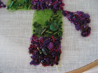
Above are my expts with altering the value of the colours as I want to change the tints and shades throughout the piece. Tints at the top and increasing in value towards the base. The sketch below shows my first attempt at a design based on patchwork squares.
Too basic I thought so moved on to playing with the grid and the sketches below show some of the more acceptable results. The top line shows the grid altered to produce a more pleasing silhouette. In the second line I have introduced triangle shapes to break up the right angles and introduce an additional geometrical shape. I introduced negative shapes in the final line and the final design is an combination of all of these ideas.

Final design incorporating patchwork squares, triangles and negative shapes as well as the colour value increasing towards the base. The stitch plan is to have the green areas in low relief stitching and minimal embellishment. The fushia coloured squares will be in high relief stitching and increasing embellishment towards the base. They will also overlap the green to soften and minimise these areas. Haven't decided how to outline the shape yet or in fact whether to at all.
Off now to transfer the design and get stitching!!!!!!!!! Looking forward this this.

Thursday, August 02, 2007

Sumptuous Surfaces Sea Urchins Finished

Spent all my free time over the past few days completing my sea urchin embroidery as part of the Sharon Boggon Sumptuous Surfaces class. Took longer than I anticipated but I think well worth it. I am particularly pleased with the recession and the way I managed to use a range of different stitches to capture the texture and surface of the urchins. I had never used drawn thread stitch in this random way before and will definately use it again.

Week four is about a new concept and design process so I'd better get started.

Saturday, July 28, 2007

Seaside Postcard

Latest 6x4 lives postcard has painted pelment vilene and muslin stuck together with acrylic paint then FME to create the impression of that part of the beach that isn't too enticing, the part where seaweed and debris meet at the tideline there might even be some oil there! The little jewels are the 3 shells bottom left and the shiny tiny broken shells in the corner. Does damp and cold English holidays sound familiar, but beachcombing always came up trumps didn't it!
The idea came as a by product of the Sumptuous Surfaces design process.


Wednesday, July 25, 2007

sumptuous surfaces stitch plan and week two

Week two of the Sumptuous Surfaces class meant quite alot of thought regarding stitch plans and then alot of stitching. I have been amazed at the range of designs being worked on and the support being given out by people all over the globe. More pictures of work being completed by other claass members on flickr - sumptuous surfaces

Stitch Plan 1.
The background is in random pulled thread and small amount of low relief surface stitches. The sea urchins to be in high density/relief stitches. The colours are strong at the front and fade away towards the top.

Stitch Plan 2.
The background is in high relief stitches/embellishment and the sea urchins in a simpler geometric manner.

I chose stitch plan 1 as I wanted to explore ways of high density stitching in a more controlled manner than a random way as the markings of sea urchins require .

The random pulled thread has worked well I feel yet the portugese stitch took so long! I watched nearly all of the Open Golf over the weekend doing it!

This close up shows how well the pulled thread has worked. I had not done this before and I will definately use it again.


Now for week 3 reading!!!!! I suspect there is a lot of stitching again this week.

Monday, July 16, 2007

Sumptuous Surfaces

This week I have been busy with lesson one of the latest Sharon Boggon class 'Sumptuous Surfaces' . Sharon has had us consider our concept for the class. After nearly a week of deliberation I think I am there. My brainstorm centred around BEACHCOMBING.


I then spent some time looking through my collection of shells and beach debris from over the years and photocopied them for my sketch book and to act as an aide memoire in developing my designs.


I started to develop certain aspects in more detail. The first was based around some sea urchins. I realised that they could be simplied into five sections and noted the different textures of the surface. I played around with design manipulation as can be seen here.


These sketches were based around shell skeletons as I realised that I had picked up just as many eroded shells as perfect ones. The skeletal form had obviously intrigued and attracted me. Ideal for positive and negative shapes and as Sharon had shown us how to develop such shapes I played around with isolating and superimposing them on to other shapes. It was then I realised that there was a difference between the smoothness of these shell skeletons and the roughness of the sea urchins.

A concept was emerging 'The response to my memories of beachcombing and collection of shells over many years. Especially that of the opposing form and texture of the perfect and the eroded structure of shells.'

I then got carried away and wanted to see whether I could incorporate beach vegetation. So these sketches utilise the solidness of the sea urchins and the flowing lines of a stylised sea holly and lichen hybrid.
So another concept evolved 'The response to my memories of beachcombing and collection of shells and beach debris over many years. Especially that of the opposing form and texure of shells and the sinuous, fibrous nature of beach vegetation.'
To finalise my design for embroidering I chose sketch A5 as I thought that the overlapping and recession achieved leant itself to an interesting well balanced result. It was necessary to add the second element though and this proved to be anything but easy.


C2 was my preferred result as it has recession, scale, overlapping, movement and balance. I'm hoping that Sharon agrees with me!!!!!