Showing posts with label sharon boggon. Show all posts

Wednesday, July 16, 2008

Tif July Challenge

The colour scheme for July as part of Sharon B's Take it Further Challenge reminds me of heather and the colours of Fair Isle jumpers so popular in the 1980s and 1990s. The theme 'Half Way Mark' got me thinking not of time but of other spects of half way. Half Full or Half Empty situations. I know so many people who swing from approaching a situation/trauma in a positive and then negative way. So I doodled postcard shapes and divided them into half, vertically, horizontally and diagonally, shading them in in a variety of ways and formats.
I chose my materials, a selection of wool and silk tops that fell into the colour scheme and embellished them onto a piece of white felt. The wool gave me the background I wanted horizontal stripes and the silk was them embellished on top in diagonal sections. I love the way some of the silk sits on the top in clumps giving the effect of heather/earthy relief.

The finished result is so reminiscent of hand knitted woollen jumpers.


Saturday, March 22, 2008

Take It Further Challenge March

This great selection of wool rovings and silk tops are following the given colour scheme for the TIF challenge this month. Sharon Boggon chosen colour scheme for March, the concept was to 'pay attention to the tiny details'.
As time was very precious this month due to many other creative commitments ( exhibitions by Silk-n-Threads at Tatton Park, the Macclesfield Embroiderers Guild at the Silk Museum and the Society of Marple Artists Ruby exhibition in April) whatever I did had to be achieveable in less than 24hours. So I decided to embellish on to black felt and use beads as the tiny details. The finished result works as a fluid swirling piece viewed from a far as the photo below shows. However, if you look closer you can see the tiny details of the beads that give the piece definition and surface texture.


These two closeups show the beads nestling in the embellished wool. I frequently employ beads and french knots to create small pockets of interest that only is realised when the viewer looks close up.

I machine edged the postcard and added it to my monthly collection.

Wednesday, February 13, 2008

TIF latest February

I have found the above in my workroom and they reflect very closely the given colour scheme for February Take it Further Challenge set by Sharon Boggon. This month's concept is 'what are you old enough to remember?' So I brainstormed the concept and always came back to my childhood and its precious memories. Family holidays in Cornwall in the 1960s were the annual highlight of the year, when beach holidays meant taking everything but the kitchen sink with you. A small gas stove to brew tea was essential and salad lunches! The colour scheme is perfect for a beach scene so that's where I'm headed this month. It will be a postcard size again and probably applique in design, still working on that.

Thursday, January 31, 2008

January TIF challenge finished

This is my finished piece for the TIF (Take it Further Challenge). It is based on the microscopic image of a gall bladder which is a tribute to my missing organ!!!!! I am feeling so much better healthwise. It is postcard size and worked on felt, the couching around the cream shape is done over machine whipped cords. To see all the finished pieces go to the TIF flickr site .
or blog .
These photos show detail of the corners.


Wednesday, November 14, 2007

Back Again!!

Been somewhat indisposed recently. Firstly I was very busy creating for two exhibitions that Silk-n-Threads were holding, both going very nicely up to date, see link on right. Then I managed to get a rather bad bladder infection due to some grit that scrapped the inside of my bladder. Both very painful and resulted in a trip in an ambulance to A&E and a visit from the emergency doctor. Two doses of strong antibiotics later I now feel better but if you have ever had to pass bladder or kidney stones you know what I went through.

However back to my workroom and finishing off all those pieces that have been sat around for far too long.

Firstly the finished book cover made from the fabric paper that I made back in early September. Pleased with the result as it is just the right size to fit in my larger handbags!


Back of the book cover.

I finally got around to having the Patchwork of Life embroidery mounted and framed ready for the exhibition at the Bollington Arts Centre.


Closeup of the stitching on Patchwork of life. I completed this as part of Sharon Boggon Sumptuous Surfaces course in the summer.

Thursday, August 23, 2007

Patchwork of Life - almost there


My second and final piece for the Sharon Boggon Sumptuous Surfaces class is almost complete. Most of the squares are complete, I just need to fill in some gaps here and there but generally pleased with the result.
Concept of patchwork of life is reflected in the half empty/half full sections, the emptiness & gaps in ones life, the isolated squares, the purity of new life and the richness and closeness of family and friends.
The green squares represent the green grass that tempts us but is no where as rich and full filling as life.Tonal change reflects the wealth of knowledge and wisdom gained throughout life.

Now that summer has at last reached the UK I am off out to the garden so I don't know when I will finish it completely!!!!!!!!1

Tuesday, August 14, 2007

Sumptuous Surfaces Piece # 2 - Half Way

I have finished the first low relief layer of my patchwork piece. The base of each square was green non woven fabric that florists use, I increased the number of layers to help with the tonal changes needed. The one inch square pieces allowed me to use a range of stitches. Click on photo to see in gretaer detail. The main challenge was to create a gradual change in tone as I progressed down the piece. Alot of squinting took place and unpicking but I think I am happy with the result so far. I expect that I will need to remove or add after the top high relief layer is finished. I have started this at the top, lilac triangle! This shows some detail of the bottom four squares, mainly dull so that they will receed rather than jump out of the piece.

Tuesday, August 07, 2007

Sumptuous Surfaces Week New Concept

The brief this week was to think in colour. When I think of colour at this time of the year it has to be my garden. The lime green of 'Ladies Mantle' aka Alchemilla Mollis is so prevalent and with the pinks/purples of the fushia, geraniums and pertunias the complementary colours on the colour wheel come to life.
Thinking beyond that India and the richness of life in colour has to be a second best. I've never been but after googling India I couldn't help but be impressed by the saris and dyes. The use of primary colours and the matching of complementaries in saris and textiles generally is so breath taking.
Finally I thought of the work of Kaffe Fassett. I am a great admirer of his use of colour in patchwork, tapestries and knitwear. I have three of his books and they never fail to inspire me.

So I put all this together and came up with an idea of using a basic patchwork design to show off the use of colour. The first colour scheme was blue and yellow, but this was disregarded and one that reflected my garden at present was chosen. Below are the colours I found in my stash.

I played with this range both in paint and thread.
Above are my expts with altering the value of the colours as I want to change the tints and shades throughout the piece. Tints at the top and increasing in value towards the base. The sketch below shows my first attempt at a design based on patchwork squares.
Too basic I thought so moved on to playing with the grid and the sketches below show some of the more acceptable results. The top line shows the grid altered to produce a more pleasing silhouette. In the second line I have introduced triangle shapes to break up the right angles and introduce an additional geometrical shape. I introduced negative shapes in the final line and the final design is an combination of all of these ideas.

Final design incorporating patchwork squares, triangles and negative shapes as well as the colour value increasing towards the base. The stitch plan is to have the green areas in low relief stitching and minimal embellishment. The fushia coloured squares will be in high relief stitching and increasing embellishment towards the base. They will also overlap the green to soften and minimise these areas. Haven't decided how to outline the shape yet or in fact whether to at all.
Off now to transfer the design and get stitching!!!!!!!!! Looking forward this this.

Thursday, August 02, 2007

Sumptuous Surfaces Sea Urchins Finished

Spent all my free time over the past few days completing my sea urchin embroidery as part of the Sharon Boggon Sumptuous Surfaces class. Took longer than I anticipated but I think well worth it. I am particularly pleased with the recession and the way I managed to use a range of different stitches to capture the texture and surface of the urchins. I had never used drawn thread stitch in this random way before and will definately use it again.

Week four is about a new concept and design process so I'd better get started.

Wednesday, July 25, 2007

sumptuous surfaces stitch plan and week two

Week two of the Sumptuous Surfaces class meant quite alot of thought regarding stitch plans and then alot of stitching. I have been amazed at the range of designs being worked on and the support being given out by people all over the globe. More pictures of work being completed by other claass members on flickr - sumptuous surfaces

Stitch Plan 1.
The background is in random pulled thread and small amount of low relief surface stitches. The sea urchins to be in high density/relief stitches. The colours are strong at the front and fade away towards the top.

Stitch Plan 2.
The background is in high relief stitches/embellishment and the sea urchins in a simpler geometric manner.

I chose stitch plan 1 as I wanted to explore ways of high density stitching in a more controlled manner than a random way as the markings of sea urchins require .

The random pulled thread has worked well I feel yet the portugese stitch took so long! I watched nearly all of the Open Golf over the weekend doing it!

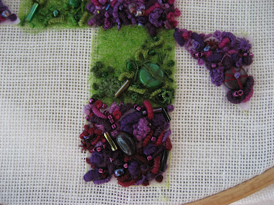
This close up shows how well the pulled thread has worked. I had not done this before and I will definately use it again.


Now for week 3 reading!!!!! I suspect there is a lot of stitching again this week.

Monday, July 16, 2007

Sumptuous Surfaces

This week I have been busy with lesson one of the latest Sharon Boggon class 'Sumptuous Surfaces' . Sharon has had us consider our concept for the class. After nearly a week of deliberation I think I am there. My brainstorm centred around BEACHCOMBING.


I then spent some time looking through my collection of shells and beach debris from over the years and photocopied them for my sketch book and to act as an aide memoire in developing my designs.


I started to develop certain aspects in more detail. The first was based around some sea urchins. I realised that they could be simplied into five sections and noted the different textures of the surface. I played around with design manipulation as can be seen here.


These sketches were based around shell skeletons as I realised that I had picked up just as many eroded shells as perfect ones. The skeletal form had obviously intrigued and attracted me. Ideal for positive and negative shapes and as Sharon had shown us how to develop such shapes I played around with isolating and superimposing them on to other shapes. It was then I realised that there was a difference between the smoothness of these shell skeletons and the roughness of the sea urchins.

A concept was emerging 'The response to my memories of beachcombing and collection of shells over many years. Especially that of the opposing form and texture of the perfect and the eroded structure of shells.'

I then got carried away and wanted to see whether I could incorporate beach vegetation. So these sketches utilise the solidness of the sea urchins and the flowing lines of a stylised sea holly and lichen hybrid.
So another concept evolved 'The response to my memories of beachcombing and collection of shells and beach debris over many years. Especially that of the opposing form and texure of shells and the sinuous, fibrous nature of beach vegetation.'
To finalise my design for embroidering I chose sketch A5 as I thought that the overlapping and recession achieved leant itself to an interesting well balanced result. It was necessary to add the second element though and this proved to be anything but easy.


C2 was my preferred result as it has recession, scale, overlapping, movement and balance. I'm hoping that Sharon agrees with me!!!!!